
THE NEW HELVETICA
WEEK 4
I came across a post on Instagram featuring a beautiful, sleek typeface, and I was immediately intrigued. After doing some research, I discovered it was competing with the iconic Helvetica, which I found fascinating, especially since I hadn’t explored variable fonts much before or realised just how versatile and diverse they can be.
People who liked Helvetica tended to use it big, in headlines, signage and bold statements — where it feels clean and confident. On the other hand, people who didn’t like it were usually seeing it in smaller text, where readability really matters. As Peter Bilak explains, digital versions can feel quite tight and closed, which makes them harder to read at small sizes. But when you scale it up, those same qualities create a really controlled and consistent rhythm, which is why it works so well for display.
This idea became the starting point for Zed, a project by Typotheque. Instead of trying to design one typeface that does everything, they treated text and display as completely separate from the beginning. The differences between Zed Text and Zed Display go way beyond spacing. Zed Text is designed to be easy to read, with more open shapes that help avoid confusion between letters. The display version is more about visual impact, with tighter, more consistent forms that work better at larger sizes. Even things like contrast are handled differently — the text version is slightly clearer for small use, while the display version focuses more on keeping a smooth, even look.
What makes the project even more interesting is how it was tested. When Integral Design was asked to create signage for a hospital in France, Typotheque saw it as a chance to test Zed in a real environment. They ran visual tests with people who had different types of vision, as well as a control group, to see how well the type performed.
The results were really clear, every version of Zed was easier to read. Small changes like wider letters, more open shapes and slightly looser spacing made a noticeable difference. It shows how even subtle design decisions can have a big impact on how something actually works.
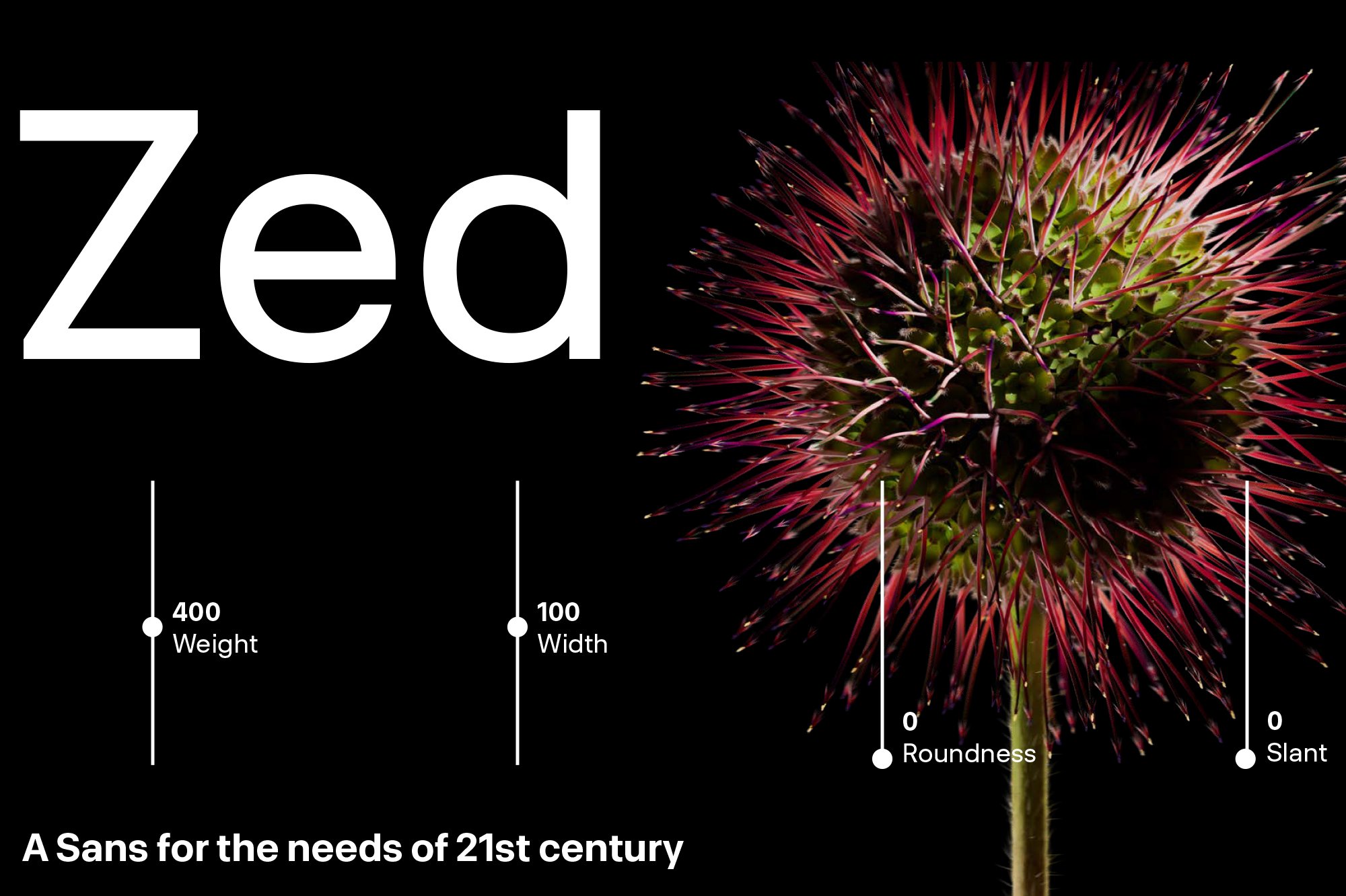
Zed is also a variable font, meaning it can be adjusted in multiple ways like weight, width and size, giving designers loads of flexibility. But at the same time, that also makes it more complex to design, because every change affects how it behaves.