
CHILDREN CAN DESIGN
WEEK 5
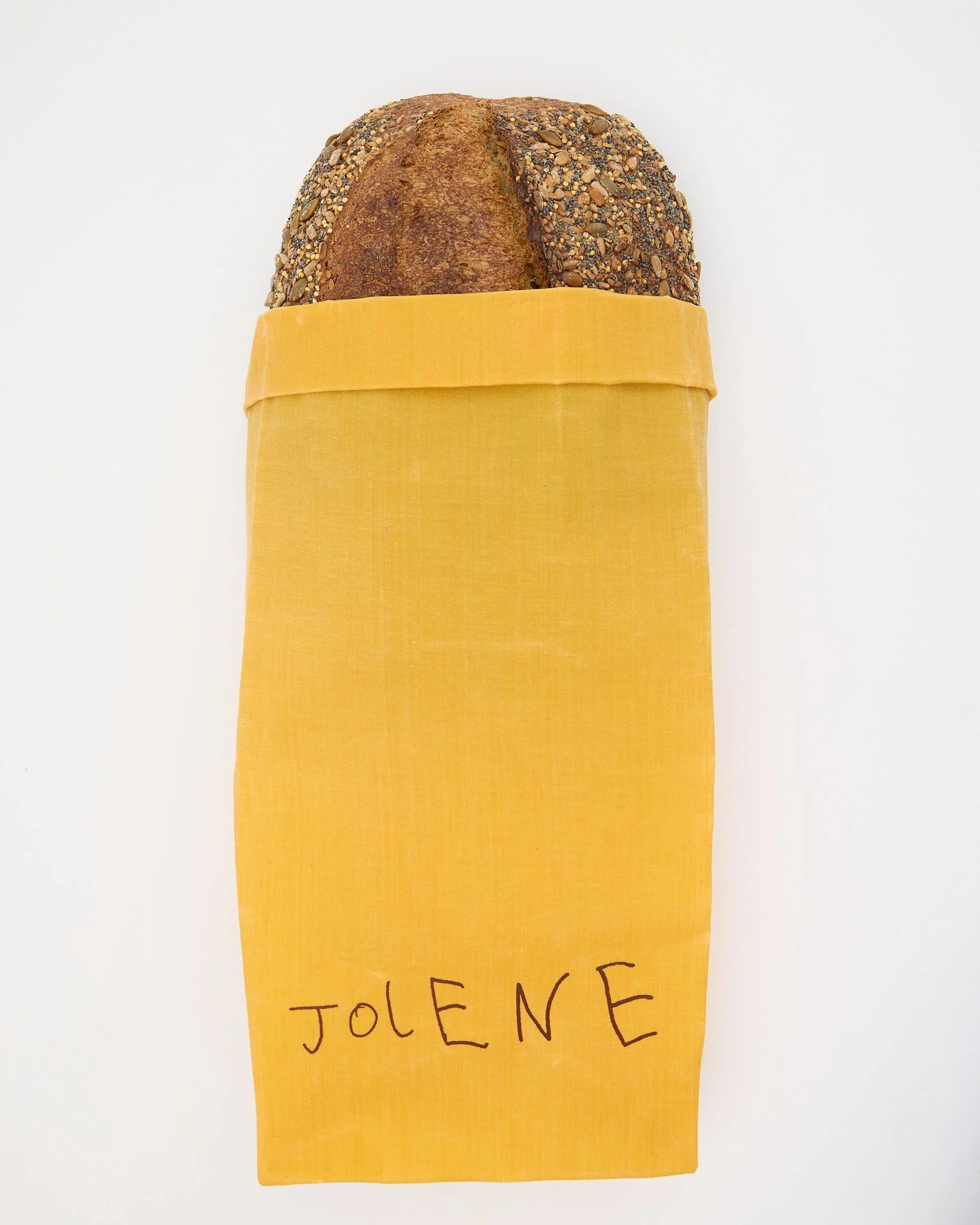
This week I was looking for inspiration for a new wordmark for my personal brand. I wanted something organic and a bit outside traditional typography rules when I came across the branding for Jolene — and it immediately grabbed my attention.
When Cometto-Lingenheim approached Studio Frith to create the bakery’s identity, the brief went in an unexpected direction. He wanted a brand that reflected the bakery’s forward-thinking values and its commitment to preserving soil for the future. Frith Kerr, the studio’s founder, translated that idea into something playful and human: she asked her six-year-old son to write the word “Jolene” on large sheets of sketchbook paper. She gave almost no direction, letting him write freely, and then created normal lowercase and uppercase versions. They deliberately avoided overworking it.
Cometto-Lingenheim recalls, “I asked Frith to come up with a logo that felt naive, and when I got the draft hand-drawn by her six-year-old son, I couldn’t have been happier.” The final wordmark mixes upper- and lowercase letters in a playful, sloping hand. But it’s not just cute, the spacing and rhythm of the letters feel deliberate, building toward a little crescendo. It feels open, hopeful, and unfinished in a way that perfectly complements Jolene’s rough plaster walls and simple bentwood chairs.
Turning a child’s handwriting into a full brand system comes with challenges, mostly making sure it doesn’t just look “like a kid wrote it.” Kerr solved this by treating the mark as an illustration rather than just text. “Once we thought of it as an image, it became a shape with its own rules. It works as both a logo and an illustration,” she explains. This approach gives the mark flexibility: it appears embroidered on curtains, stamped on menus, printed on tote bags, and more. Its handmade quality makes it feel natural across applications, and every use leans into the playful, human character of the wordmark.
Even the animations Studio Frith created follow the same idea simple, childlike, and non-hierarchical, reflecting Jolene’s approachable and open ethos.
Seeing the Jolene branding was really inspiring for me. It showed how breaking away from traditional rules and embracing a playful, human approach can create something memorable and flexible. The way a child’s handwriting became a full, functional brand made me think differently about how personal and imperfect elements can be used thoughtfully in design. It’s encouraged me to experiment more with my own wordmark, to embrace organic forms, and to find creative ways to make something feel both personal and purposeful.