
WHO LET THE DOGS OUT?
WEEK 6
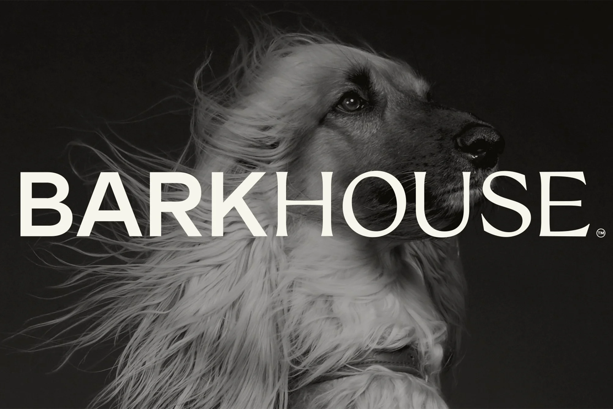
One of my favourite design agencies in Belfast, Crown Creative, recently surprised me with a project for a dog brand, and it’s absolutely brilliant. Instead of leaning on the usual overly cutesy or clinical “doggy daycare” aesthetics, the team created something elegant, contemporary, and full of personality. Barkhouse feels classic yet playful, combining refinement with a sense of movement and fun.
From logos printed on fetch balls to a Barkhouse Bulletin newspaper, the identity is packed with thoughtful details. The team drew inspiration from The New Yorker, using loose, observational drawing styles for Barkhouse’s whimsical animated illustrations. “Dogs are instinctive and expressive, so we tried to reflect that in the line work — keeping it slightly imperfect, textured, and focused on movement,” says Ryan.
Typography plays a big role too. The team paired a serif and a sans serif typeface to capture two audiences at once: the dog and its owner. The serif adds “refinement and trust,” while the sans brings “warmth and immediacy,” Ryan explains. “We liked the idea that one feels like the owner’s voice and the other like the dog’s — not literally, but in tone.”
The illustrations depict over ten dogs, including ones belonging to the founders and Crown Creative’s own team. Rather than generic canine drawings, each dog is captured as a real character — the way it sits, moves, and carries itself. That attention to personality is what makes Barkhouse so charming. It’s a fresh take on the canine daycare industry, blending domestication with playful freedom, and giving the brand a lovable, distinctive personality.