
OUT FOR A PINT
WEEK 13
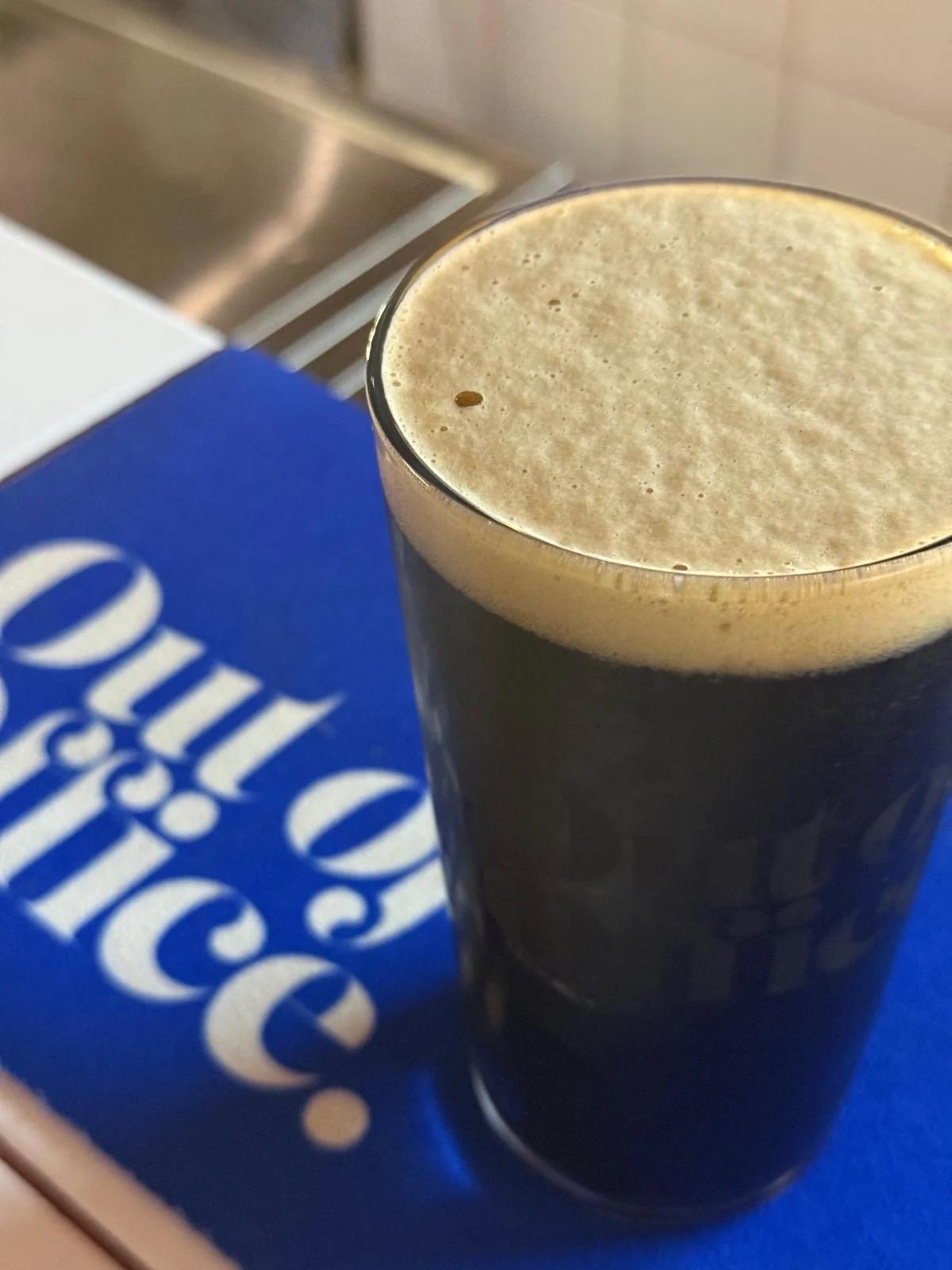
One night out in Belfast, I ended up noticing the branding of Out Of Office more than the beer itself. Surrounded by the usual dark colours, vintage-looking labels, and really traditional brewery branding, theirs instantly felt different.
The bright blue was the first thing that caught my eye. Most alcohol branding, especially breweries, tends to stick to darker tones or rustic colours to feel “authentic,” but Out Of Office completely goes against that. The bold blue mixed with white typography and pops of yellow feels fresh, playful, and energetic. It almost feels more like a creative brand or music event than a brewery, which honestly makes it way more memorable.
I also really liked how confident the typography feels. The large serif logo has loads of personality, while the rest of the type stays clean and simple, which keeps everything balanced. Nothing feels overly serious or corporate but feels fun, social, and creative.
What makes the branding work so well for me is that it focuses more on the experience around the beer rather than just the product itself. The photography feels natural and candid, showing people enjoying themselves instead of overly staged product shots. Even the hand-drawn arrow graphics and playful layouts give the brand a more relaxed and expressive personality.
Seeing it in person made me realise how different it feels compared to a lot of other alcohol branding. Instead of trying to look traditional or vintage, Out Of Office feels modern, bold, and culture-driven. It feels designed for people who enjoy the social side of going out just as much as the drink itself.
As a designer, I found it really inspiring because it shows how branding can completely change the feeling of a company. Out Of Office doesn’t just sell beer — it sells a vibe, and that’s what makes it stand out so much.